
Overview
Time And History is an app for Jira Cloud that measures how long your issues spend in every stage of your workflow. It reads the Jira issue history — every field change Jira records on an issue — and converts it into working time using your own work calendars, so weekends, evenings and holidays never inflate the numbers. This guide covers version 2.4 of the app, which runs on Jira Cloud.
The app includes five reports:
- Time in Status — how long each issue stayed in every workflow status, as a table with Avg / Median / Min / Max per status or as interactive charts;
- Time in Changes — the Jira issue history, field by field: who changed what, when, and how long each previous value lasted;
- Assignee Time — how long each issue spent with every assignee;
- Time to Resolution — how long issues take from creation to each resolution, in business hours;
- Transition Count — how many times each status pair occurred on an issue, so rework and reopens become a number (see Transition Count).
Four features cut across the reports:
- the report scope in the header — filter chips, raw JQL or one of your Jira saved filters, the same three choices on every report;
- presets, which keep a view under a name and bring it back in one click;
- the Between Statuses columns, which measure the working time between any two statuses on Time in Status;
- scheduled reports, which mail any report to your team daily, weekly or monthly.
Inside Jira the app is available from four places:
- the Time And History item in the Jira top navigation bar opens the five reports and the Scheduled Reports page;
- the Jira issue view — the Time And History panel you add from the Apps menu shows all five reports for the issue you are looking at;
- Jira dashboards — dashboard gadgets (a chart and a table for each of the five reports) in the Add a gadget picker;
- Jira Settings → Apps contains the Time And History section with the Access Settings and Calendars admin pages.
Getting started
- Install the app. Get Time And History on the Atlassian Marketplace — free for up to 10 users on Jira Cloud. Right after installation the Get Started page walks you through the first steps.
- Explore the reports. Open Time And History from the Jira top navigation bar, pick a project and a date range, and see where time goes.
- Set up work calendars. Define business days, work hours and holidays so every duration counts only real working time (see Work calendars).
- Grant access to your teams. Choose which Jira groups can view reports and manage calendar or permission settings (see Access Settings).
- Put the answer on the ticket. Open any issue, press Apps and add Time And History — the panel under the description shows all five reports for that issue (see Time in Status on the Jira issue view).
- Put the numbers on a dashboard. Add a gadget for any of the five reports to a Jira dashboard so the team sees the figures without opening a report (see Jira dashboard gadgets).
- Send the report by email. Set the filters on a report page, then open Scheduled Reports and create a schedule — daily, weekly or monthly, to up to ten recipients you type yourself (see Scheduled reports by email).
Every Jira read runs as the person using the app. Everyone sees only the projects and issues they can already access in Jira — the app never widens anyone’s visibility. The same applies to gadgets: each viewer sees the dashboard numbers computed from the issues they can access. The one exception is a scheduled report: the run collects as the schedule owner, so its recipients read the owner’s view of Jira, not their own.
Reports & filters
Every report page is built the same way: a header that decides which issues the report covers, and a view bar under it that decides how they are shown. The header is the same on all five reports and has a section of its own — see Report scope: filters, JQL and saved filters. The view bar holds the Presets pill, the work calendar, the time format, Columns, Between statuses, Export and the table / chart toggle. The app remembers your selection: the next time you open it, your report, scope, period, calendar, time format and columns are restored exactly as you left them.
The controls differ in exactly two places: Time in Changes replaces the Columns selector with its own History by Fields control, and Transition Count has no work calendar and no time format, because it counts events rather than working time. Every other report has all three.
Filters
The filter chips live in the header: Project (multi-select, up to ten) and Period are pinned, followed by Sprint, Assignee, Issue type, Epic, Reporter, Labels and Components. An empty chip means “Any”; changing the projects reloads their epics, sprints, issue types, components and users, and narrows what is already selected. The full list, the limits and the two other ways to pick issues are in Report scope.
The calendar selector sits on the view bar as Working hours: it is the work calendar every duration in the report is computed against, it is your own setting, and it is shared by every report that measures time, by your gadgets and by the issue view panel (see Work calendars).
Date range
The Period filter limits the report to a date range. Pick a preset — Any Days, Yesterday, Last 7 Days, Last 30 Days, This Month, Last Month — or choose a custom range with a start and an end date on the calendar. The range is applied to one of three issue date fields:
- Created — shows issues created in the selected period;
- Updated — shows issues updated in the selected period;
- Resolved — shows only resolved issues from the period.
Period is a filter chip like the others, so it is paused — shown disabled — while the report runs on JQL or on a saved filter. Put the date clause in the query itself in those modes (see Report scope).
Time formats
Durations in the four reports that measure time can be displayed in four formats; the choice is saved per user. The format changes only the unit — the value behind it is always the same working time, counted against your work calendar. The table below shows one and the same duration in all four formats.
| Format | The same duration | What it means |
|---|---|---|
| HM | 25h 43m | Working hours and minutes. The default format. |
| Decimal Hours | 25.72 | The same working hours as a decimal number. |
| DHM | 1d 1h 43m | The same working time expressed in 24-hour blocks. A “day” here is 24 accumulated working hours, not one business day — on a 9:00–17:00 calendar, “1d” means three working days. |
| Decimal Days | 1.07 |
Switching between the formats never re-counts anything: the app calculates the working seconds once, against your calendar, and each format simply divides that number by hours or by 24 hours. Weekends, evenings and holidays stay excluded in DHM and Decimal Days exactly as they are in HM.
Columns
In Time in Status, Assignee Time, Time to Resolution and Transition Count, the Columns selector controls which Jira fields appear in the report table. Search across all fields (system and custom), switch between Active and Inactive tabs, toggle fields on or off and press Save — the selection is saved per user. The default columns are Type, Key, Priority, Reporter, Assignee and Status. Time in Changes uses a fixed column set instead.
Editing issues inline
Hover over a Type, Priority, Assignee or Reporter cell and click the pencil to open the Edit issue dialog. You can change the issue type, priority, assignee (including Unassigned) and reporter without leaving the report — after saving, the report reloads automatically.
Pagination
Reports are paginated at 15 issues per page. The footer shows the current range (for example, 1 - 15 Of 320) with previous/next navigation, a refresh button and a Send Feedback action.
Report scope: filters, JQL and saved filters
Since 2.4.0 the header of every report carries a Filters | JQL | Saved filter switch and the filter chips. It decides which issues the report covers, and whatever you choose drives everything downstream: the table, chart mode, the export and a scheduled email report.
Filters: the nine chips
In Filters mode the scope is a row of chips, in this order: Project, Period, Sprint, Assignee, Issue type, Epic, Reporter, Labels and Components. Project and Period are pinned and always visible; whatever does not fit the window collapses into a More filters chip whose badge counts what is hidden. An empty chip means “Any”, and an empty Project chip means all projects you can see.
- Project is multi-select — up to ten at a time. With two or more projects selected, the Epic, Sprint and Components lists group by project so two identically named sprints cannot be confused.
- Removing a project narrows the rest. Epics, sprints, components and issue types that belonged only to it disappear from the selection, and the app tells you what it removed.
- Limits: 10 projects, 50 epics, 50 sprints, 20 issue types, 50 labels and 50 components. The chip says so when you reach one.
JQL mode
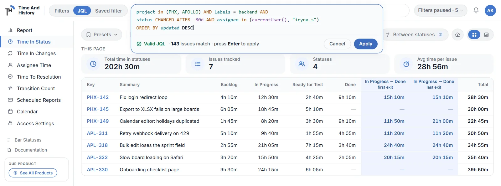
Switch the header to JQL and an editor opens over the report. Type or paste a query of up to 2,000 characters; it is syntax-highlighted as you type — fields, keywords, operators, values and functions each in their own colour — and checked against Jira before it runs. A valid query shows the count it will return, “Valid JQL · 143 issues match · press Enter to apply”. An invalid one is underlined, Apply stays blocked and the message printed under the editor is Jira’s own, word for word — for example “Error in the JQL Query: The character '&' is a reserved JQL character.” — with the previous result still on screen.
In JQL and Saved-filter mode the app adds nothing to your query — no project clause, no date clause. That is why the count in the editor and the number of rows in the table agree. It also means your own ORDER BY is passed through untouched.
Saved filter mode
Saved filter lists the Jira filters you can already use: the ones you starred, the ones you own and the ones shared with you, searchable by name. Pick one and its resolved JQL is shown read-only beside the chip together with the match count, so you can see exactly what the report is about to run.
- the filter is read as you, with your Jira access — not as the app and not as the filter’s owner;
- a filter that was deleted, or that you lost access to, is reported with Jira’s own message; the report is never silently emptied.
Filters are paused, not cleared
Switching to JQL or to a saved filter does not throw your chips away. They are held and shown greyed as Filters paused · 5, the Period chip with them, and switching back to Filters restores exactly the cut you had. The three scopes live side by side: your chips, your query and your chosen filter are all remembered.
Where the scope travels
- the table and chart mode of every report;
- every export — XLSX, CSV and the chart PNG;
- a scheduled report, with one difference worth knowing: a schedule created on JQL freezes the query text, so your text never changes under you, while a schedule created on a saved filter stores the filter and re-reads it on every run, as the schedule owner — edit the filter in Jira and the next mailout follows;
- a preset, which stores whichever of the three modes was active when you saved it.
Two limits to keep in mind. Relative dates in a query (updated >= -7d) are resolved by Jira in the time zone of the account running the report, while chart periods are grouped in the work calendar’s zone — on the edge of a day the chart and the table can disagree by one bucket. Dashboard gadgets keep their own filter form and do not have the scope switch.
Time in Status
The flagship report answers the question “where does our time actually go?”. For every issue it shows the working time spent in each workflow status, plus a Total Time From Create Issue column.
Table mode
- one column per workflow status found in the filtered issues — statuses appear automatically, no configuration needed;
- your selected Jira fields as leading columns (issue keys link to Jira, user chips show avatars, statuses and priorities are color-coded);
- empty cells display “-” when an issue never visited a status.
How the Avg, Median, Min and Max footer is scoped
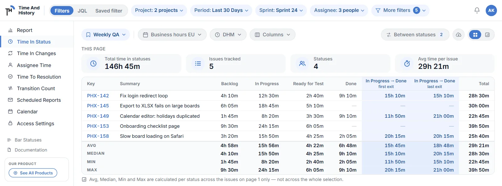
The average time in status for the issues on the current page appears in the table footer, next to the Median, Min and Max working time for every status column, for the total and for every Between Statuses pair column you added. The footer states which page the statistics cover, and issues that never entered a status are not counted for that status. They use the same work calendar and time format as the rows, so the summary and the cells beneath it are always on the same clock. For why the mean and the median disagree, and which issues each of the four numbers covers, read what the Jira average time in status hides on the SolaceIn blog.
Between Statuses columns
The Between statuses pill, to the left of Export, adds a column for the working time between any two statuses you pick — for example In Progress → Done. It belongs to Time in Status and appears on this report only: up to ten pairs, saved for you, shown in the table and carried into every export. See Between Statuses: time between two statuses.
Chart mode
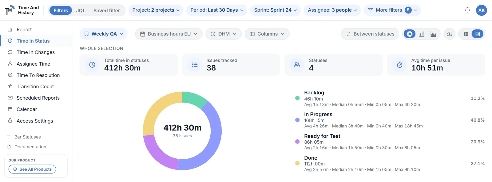
The view toggle in the controls row switches the report to a donut, bar or area chart, with KPI tiles above it covering the whole selection. Chart mode and the tiles work the same way on all five reports, so they have their own section — see Charts & KPI tiles.
Both modes export to XLSX and CSV, and chart mode adds a PNG of the chart on screen — see Export reports to Excel (XLSX), CSV or PNG. The same report is available as a dashboard gadget, and it can arrive by email on a schedule — see Scheduled reports by email.
Time in Changes: Jira issue history report
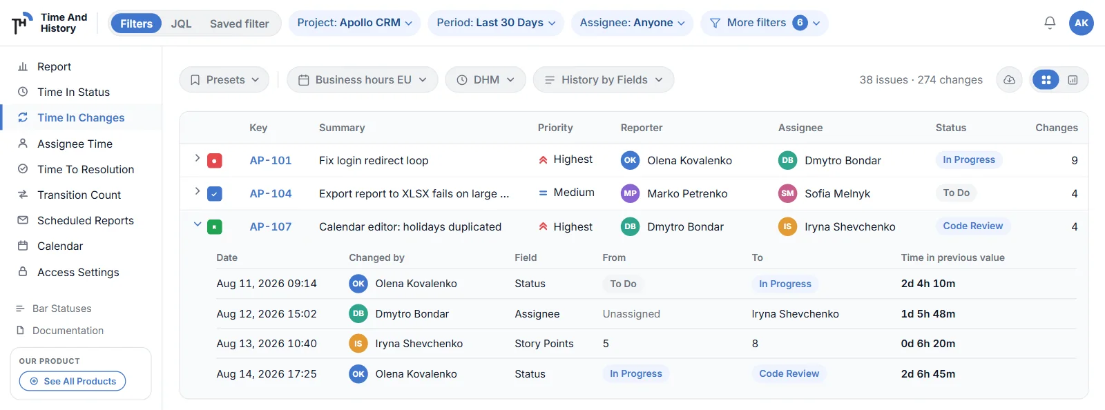
Time in Changes turns the Jira issue history into a report — who changed what, when, and how long each value lasted. The main table lists issues with a Total Time From Created column; every row expands into the issue history behind it.
Issue history drill-down
Click a row (or its chevron) to expand the issue’s history:
- Date — when the change happened;
- Changed By — who made the change;
- Field — which field changed (Status, Assignee, Priority…);
- Old Value / New Value — the transition itself;
- Time In Old Value — the working time the previous value lasted, calculated with your work calendar.
The last row of each history shows the current value and the time elapsed since the most recent change.
History by Fields
The History by Fields selector chooses which fields appear in the drill-down. Search the field list, toggle the fields you care about and press Save — the selection is remembered per user. The report covers the standard Jira fields — status, assignee, priority, reporter, issue type, summary, description, labels, due date and resolution — and, since 2.4.0, custom fields as well: Story Points, Sprint or any other custom field whose changes Jira records in the issue changelog, next to the standard ones. The same fix covers the system fields Jira names by a display word rather than a key, such as attachment, fix versions, versions and components. A few changelog entries that carry no field id, such as worklog ids and Epic Child, can’t be picked.
On a dashboard, the Time in Changes gadget counts the number of changes per selected field instead of listing them. The report page has a chart mode of its own — changes per field as a bar, donut or area chart, with KPI tiles above it (see Charts & KPI tiles).
Assignee Time
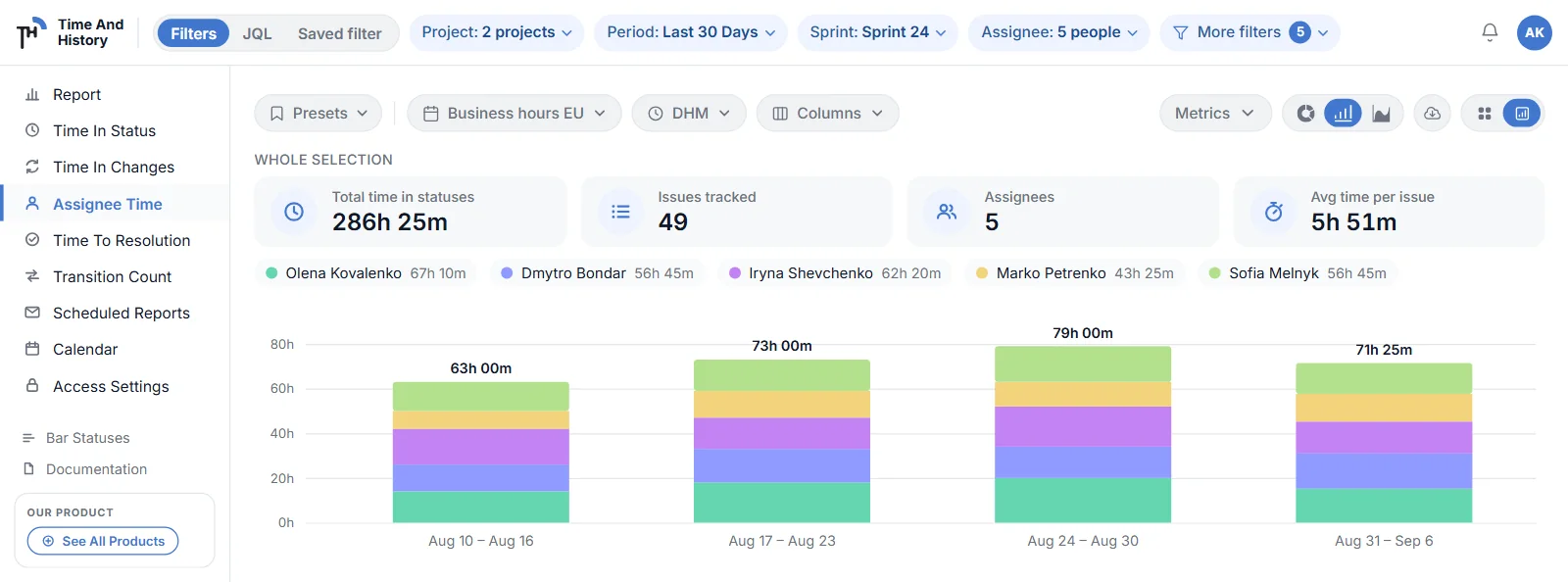
Assignee Time shows how long every issue spent with each assignee — ideal for understanding who carries the load and balancing work across the team.
- one column per assignee, with avatars linked to their Jira profiles;
- an Unassigned column accumulates the time issues spent without an assignee;
- the Total Time From Create Issue column sums each issue’s full working age.
For a team-level view, the Assignee Time (Table) dashboard gadget summarises the same data per person: KPI tiles for the total time, issues tracked, number of assignees and average time per issue, plus a table in which each assignee expands into per-status rows.
The report page itself also has a chart mode — hours per assignee as a donut, bar or area chart, with KPI tiles for the whole selection above it (see Charts & KPI tiles).
Time to Resolution
Time to Resolution measures how long issues take from creation to being resolved, in business hours from your work calendar — the honest version of your delivery time.
- each resolution gets its own column, named after the resolution value with an ordinal for repeats; an issue resolved as Done, reopened and resolved again is kept apart as Done 1st and Done 2nd, and one closed as Won’t Do reads Won’t Do 1st, so you can see how often issues come back and on what verdict;
- the Total Time To Resolution column sums the working time across an issue’s resolution passes; the stretch an issue spends already resolved, before it is reopened, is not counted;
- unresolved issues display “-” with the hint “The issue has not been resolved yet”.
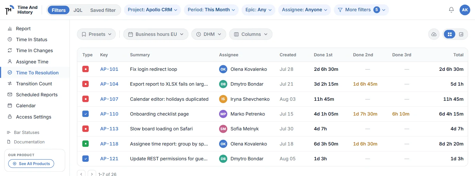
Every column here exports to XLSX and CSV over each issue the filter matched rather than the page on screen, and the same filter can arrive by scheduled email daily, weekly or monthly.
Transition Count: how many times statuses change
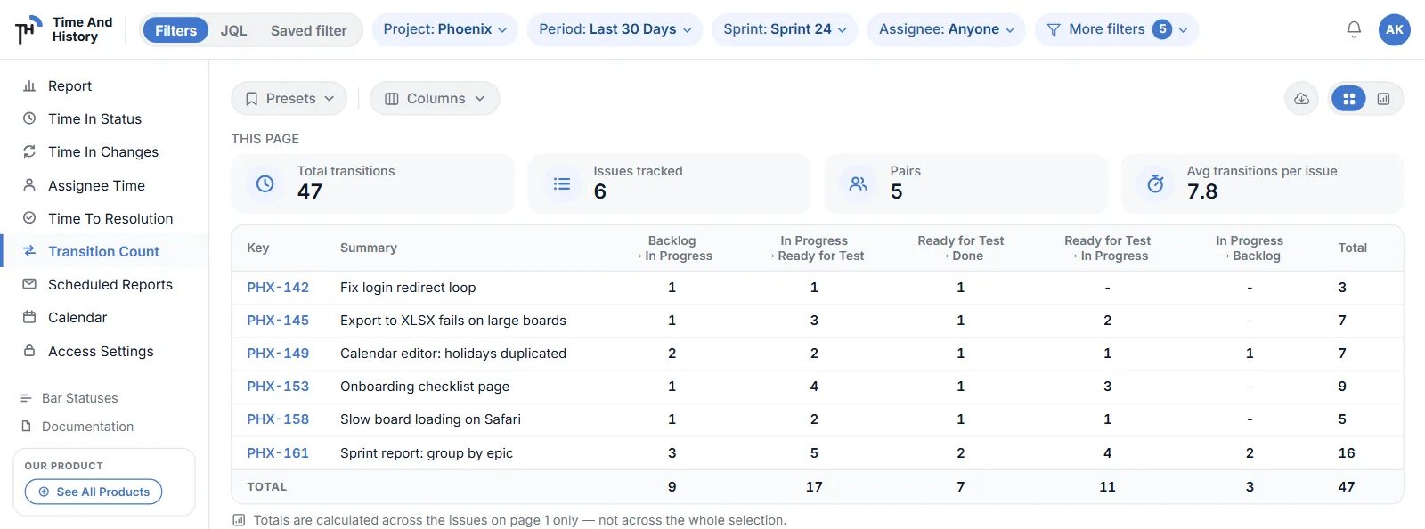
Transition Count is the fifth report, and the only one that counts events instead of measuring time. For every issue it shows how many times each status pair occurred — Ready for Test → In Progress: 3 — so rework and reopens stop being a feeling and become a number you can sort, chart and export.
What the table shows
- one row per issue, with your selected Jira fields as the leading columns;
- one column per status pair that actually occurred in the filtered issues — the pairs appear on their own, there is nothing to configure;
- a Total column with every transition counted on that issue;
- a TOTAL row under the table, summing each pair column.
Those totals are calculated across the issues on the page shown, not across the whole selection — the note under the table says so on screen. Switch to chart mode, or export the report, to work over every issue the filters match.
Filters
Transition Count filters by project, epic, sprint, reporter, assignee and date range exactly like the other four reports, and it has the same Columns selector. What it does not have is a work calendar or a time format: the values are whole numbers of transitions, so no working time is involved and no calendar can change them (see Reports & filters).
Charts, tiles and export
Chart mode draws the counts as a bar chart — the default on this report — or as a donut or an area chart, and the KPI tiles read Total transitions, Issues tracked, Pairs and Avg transitions per issue (see Charts & KPI tiles). The report exports to XLSX and CSV, and chart mode adds a PNG of the chart on screen (see Export reports to Excel (XLSX), CSV or PNG).
Like the other reports, Transition Count is available on a Jira dashboard as a chart gadget and a table gadget — see Jira dashboard gadgets.
Between Statuses: time between two statuses
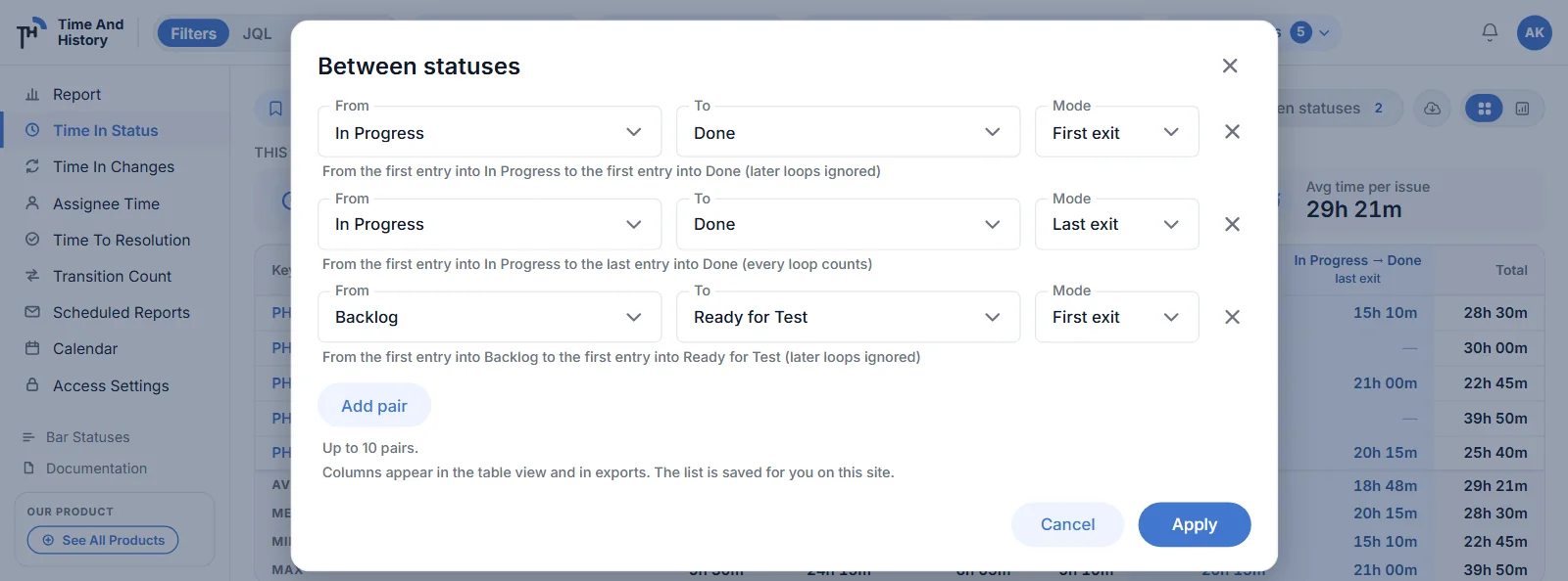
Between Statuses answers “how long from In Progress to Done?”. Pick any two statuses and the working time between them becomes a column in the Time in Status table — one column per pair, counted against your work calendar like every other duration in the app.
Adding a pair
- Load the Time in Status report for the project and period you care about. The status lists come from the issues on the page, so the report has to be loaded first.
- Open Between statuses — the pill to the left of the Export button; its badge shows how many pairs you already have.
- Pick a From, a To and a mode, use Add pair for the next one, then press Apply. Up to ten pairs.
The pill and the columns belong to Time in Status only; the other four reports have neither.
First exit and last exit
The mode decides what happens when an issue loops back:
- First exit (the default) — from the first entry into the first status to the first entry into the second, so later loops are ignored;
- Last exit — from the first entry into the first status to the last entry into the second, so every loop counts.
An issue that went In Progress → Done → In Progress → Done therefore has two honest answers: first exit reports how long the first pass took, last exit reports how long the issue took including the rework. Add the same two statuses twice, once in each mode, and the table shows both numbers side by side. For a worked example of both modes on one reopened issue, and how to read the footer under the columns, read the Jira time between two statuses walkthrough on the SolaceIn blog.
What you get
- one tinted column per pair, headed with the pair — In Progress → Done — and the mode on the line beneath (first exit or last exit); an export joins the two into one header cell, In Progress → Done (first exit);
- that column’s own Avg, Median, Min and Max in the table footer, for the issues on the current page;
- the same columns in every export — XLSX and CSV alike — and in a Time in Status schedule;
- a list saved for you on this Jira site, so the columns come back next session. It is personal: it changes nothing for anyone else.
Limits and rules: at most ten pairs; the To list never offers whatever From already holds, so a pair cannot point at itself, and adding the same pair twice stops Apply on the repeat until you remove it; the order of the list is the order of the columns. The numbers are working time, so they follow your work calendar exactly as the status columns do.
Charts & KPI tiles
Every report page has two modes and one strip of numbers above them. The view toggle in the controls row switches between the table and the chart; the four KPI tiles sit above both, and they always say which issues they cover.
Chart mode
Chart mode is available on all five reports. Chart data is aggregated over all issues matching the filter, not just the current page — a progress bar shows the preparation status, the preparation can be cancelled at any time, and a running chart job survives a filter change instead of starting over.
- Donut chart — the share of the total per series, with a legend showing the values. Click a legend item to hide or show a series; the centre displays the total issue count.
- Bar chart — stacked values per period, with per-series tooltips.
- Area chart — a stacked timeline; the Points view settings show dots on every period and keep numeric labels next to them.
Donut is the default on Time in Status, Assignee Time and Time to Resolution; bar is the default on Time in Changes and Transition Count. For bar and area charts, the Metrics dropdown sets the grouping period: Auto, Day, Week, Month, Quarter or Year, where Auto follows your date range. A donut has no periods, so the control is hidden while a donut is on screen.
Chart mode is also where the PNG export lives: while a chart is open, the Export menu offers Chart Image (.PNG) on any of the five reports (see Export reports to Excel (XLSX), CSV or PNG).
KPI tiles, and which issues they cover
Four tiles sit above every report: a total, Issues tracked, the number of series the report groups by, and an average per issue. The caption above them is the scope contract, and it is worth reading before quoting a number anywhere:
- This page — above a table. The tiles are calculated across the issues on that page only, exactly like the table footer.
- Whole selection — in chart mode. The tiles cover every issue the current filters match, not only the page.
| Report | Total tile | Third tile | Average tile |
|---|---|---|---|
| Time in Status | Total time in statuses | Statuses | Avg time per issue |
| Assignee Time | Total time in statuses | Assignees | Avg time per issue |
| Time to Resolution | Total time to resolution | Resolutions | Avg time per issue |
| Time in Changes | Total changes | Fields | Avg changes per issue |
| Transition Count | Total transitions | Pairs | Avg transitions per issue |
Issues tracked is the second tile on every report. The third tile counts series — statuses, assignees, resolutions, selected fields or status pairs — and not issues. Above a table it counts the series present on that page; in chart mode it counts them across the whole selection, so the two can differ. Time in Changes is the exception: its Fields tile counts the fields you selected, so it is the same number in both modes. While a report is still loading, a tile shows a dash rather than a zero.
Two neighbours that are easy to confuse. The tiles on a (Table) dashboard gadget are a third scope again: they cover every issue matching that gadget’s own filter. And the Avg / Median / Min / Max footer is a Time in Status feature — Transition Count has a TOTAL row instead, and Assignee Time, Time to Resolution and Time in Changes have neither.
Presets: save and reuse a report view
A preset is a named copy of a view. It is the first control on the view bar of every report — a pill reading Presets until one is applied, then the preset’s name. New in 2.4.0.
What a preset remembers
A preset stores two blocks of settings:
- On any report — the scope (the mode, the chips, the JQL text or the saved filter), the period, the work calendar and the time format;
- On the report it was saved on — the Columns selection (or History by Fields on Time in Changes) and the Between Statuses pairs.
What a preset does not carry: table or chart mode, the chart type, the chart metric, the page size and the report itself. A preset configures the page you are on; it never navigates you to another report.
Applying, updating, reverting
- Save a view. Set the scope, period, calendar, format and columns you want, open the Presets pill and choose Save current as…. The dialog lists what the preset will remember, in the two blocks above, before you name it.
- Apply it. Click a preset in the menu and it becomes your current view — not a preview: the report reloads on it and it is still there after a refresh.
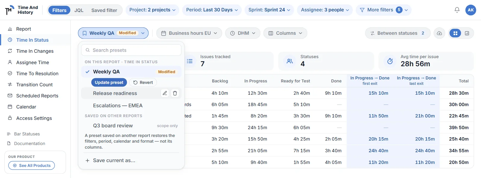
- Update or revert. Change anything afterwards and the pill gains a Modified tag, with Update preset and Revert under the applied row in the menu.
Hovering a row reveals rename and delete. The menu is sorted A to Z and split in two groups: ON THIS REPORT and SAVED ON OTHER REPORTS. Applying one from the second group restores the first block only — the menu marks the row scope only, because columns and status pairs belong to the report they were saved on.
Limits and ownership
- presets are personal: they belong to the person who saved them, and nobody else sees or changes them. There are no team-wide presets in 2.4.0;
- 50 presets per person, across all five reports;
- a name is 1 to 80 characters and unique per person, ignoring case — saving a second “Weekly QA” is refused rather than silently overwriting the first.
If a preset points at a work calendar that has been deleted, or at a Jira saved filter you can no longer read, applying it still works: the app warns you about that one setting and keeps your current value for it, instead of failing the whole apply.
Schedules built from a preset
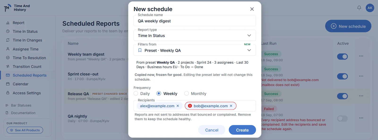
A scheduled report can take its filters from a preset: the editor offers Filters from: Current view or Preset · <name>, and the schedule row then says which preset it came from.
- the schedule copies the preset when it is created — the snapshot is frozen exactly like a schedule built from the report page;
- edit the preset afterwards and the row is badged PRESET CHANGED SINCE; opening the schedule then offers Use the preset’s current filters, which re-takes the snapshot;
- deleting a preset never touches a schedule: the schedules created from it keep their frozen copy and keep running.
Scheduled reports by email
A schedule sends a report to your team by email — daily, weekly or monthly, at the time and in the time zone you choose — without anyone opening the app. The attachment is the same XLSX the report’s own export builds, and every run is listed in Export History.
Create a schedule
- Set the filters on a report page first. The schedule takes a snapshot of them. Until a project is selected, creating one is blocked with “Select a project on a report page first”.
- Open Scheduled Reports in the app sidebar and press New schedule.
- Fill in the editor — the fields are below — and press Create.
The editor holds, in order:
- Schedule name — 1 to 80 characters;
- Report type — any of the five reports;
- Filters from — Current view (a read-only snapshot of what is set on the report page) or one of your presets. Either way they are fixed when the schedule is created; to report on something else, change them and create another schedule, or re-take the snapshot from the preset (see Presets);
- Frequency — Daily, Weekly or Monthly;
- Start date, Start time and Time zone — the editor spells the result out for you, for example Runs every Monday at 09:00;
- Recipients — between one and ten addresses that you type. Nobody is added implicitly, not even you, so add your own address if you want a copy.
The Scheduled Reports list
Each row shows Name, Report, Frequency, Recipients, Last Run and an Active toggle, with a row menu holding Edit, Run now and Delete. Run now marks the schedule due, and the row reads Queued until that run starts.
Last Run is one of Success, Failed, Skipped, Running or Queued — or a dash, when the schedule has not run yet.
What arrives
- the report as an XLSX attachment, as long as the file is 7 MiB or smaller. A larger file is not attached and the mail says it can be downloaded from Export History instead;
- a Time in Status schedule carries your Between Statuses columns;
- every run is listed in Export history as an ordinary export row, and those rows stay there even after the schedule is deleted.
Delivery status: bounces and spam complaints
Since 2.4.0 the Scheduled Reports page tells you whether the mail actually arrived. Three kinds of event come back from the mail provider:
- a bounce — the address does not exist any more, or the receiving server rejected the mail permanently;
- a complaint — somebody marked the report as spam;
- a temporary bounce — a full mailbox or a server that was briefly unavailable. It is reported as temporary bounce and the address keeps working; the next run mails it again.
Where you see it:
- on the recipient — the avatar gets a red ring and an exclamation mark, on the schedule row and on the recipient chips in the editor. Hover it for the date and the reason;
- on the run — a red sub-line under the last-run lozenge: “Not delivered to [email protected] (mailbox does not exist)”. At most two addresses are printed, with “and 3 more” for the rest and the full list in the cell’s tooltip; the reason in brackets appears only when every listed address failed for the same reason;
- in the editor — a hint under the recipients field when any address on the schedule is undeliverable. Save is never blocked.
A run that reached somebody stays Success. The report went out; the sub-line names who did not get it. Only when every address on the schedule is undeliverable does the run fail — and the schedule is switched off with the reason on the row: “Every recipient address has bounced or complained. Edit the recipients and save the schedule again.”
There is no retry to an address that bounced or complained. Mailing it again would damage the sending reputation of every customer, so the app stops writing to it. The fix is the owner’s: open the schedule, remove that address (or replace it with a working one) and save. A complaint is never lifted — if the person wants the report back, use a different address.
Whose Jira the recipients see
A scheduled run collects as the schedule owner, not as each recipient. Everyone on the list receives the owner’s view of Jira, so put on it only people who are meant to see those issues. On the report pages the opposite holds: every Jira read runs as the person looking at the report.
When a schedule stops
- after three consecutive failed runs a schedule is deactivated and the row says so; switch Active back on once the cause is fixed;
- if Jira answers 401 or 403 for the owner — the owner’s own access is gone — the schedule is deactivated immediately, because retrying cannot help;
- Jira rate limiting never deactivates a schedule and does not count towards those three failures: the run reports that Jira is throttling, and the next run retries;
- a schedule whose recipients have all bounced or complained is deactivated on the first such run — see Delivery status;
- Skipped means mail delivery is not configured on the deployment.
Who can create one
The Scheduled Reports page is gated by the same Report grant as the report pages: whoever may open the reports may schedule one (see Access Settings).
Jira dashboard gadgets
All five reports are also available as Jira dashboard gadgets — each as a chart and as a table. The gadgets use the same calculation and permissions as the report pages, and the ones that measure time inherit your selected work calendar rather than carrying one of their own, so the number on the dashboard is the number in the report. Jira’s Add a gadget picker lists a gadget for each report — Time in Status, Assignee Time, Time to Resolution, Time in Changes and Transition Count — and a (Table) variant of each. There is no gadget for Between Statuses; it lives on the Time in Status report page.
Add a Time in Status gadget to a Jira dashboard
- Open the dashboard in Jira and click Edit (you need edit rights on the dashboard).
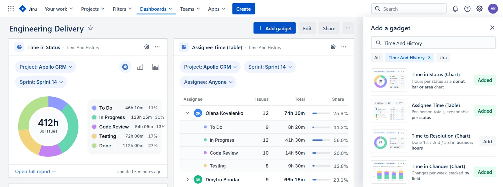
- Click Add gadget and search for Time And History. The picker lists the app’s gadgets with a preview of each.
- Pick a chart or a table. Time in Status adds a chart; Time in Status (Table) adds KPI tiles and a table. Every other report has the same pair.
- Configure and save. Choose at least a project in the gadget’s configuration form (below) and press Save, then leave the dashboard’s edit mode.
Configure the gadget
Open the gadget menu and choose Configure (the gear). The form holds:
- Project — the project to report on;
- Epic, Sprint, Assignee — optional narrowing filters;
- Period — the same presets as the report pages, or a custom range picked on a calendar with a start and an end date;
- Time format — HM, DHM, Decimal Days or Decimal Hours (gadgets that measure time only);
- View — Chart or Table;
- Visualization — Donut, Bar or Area (chart view).
The configuration is saved per gadget instance and applies to everyone who opens the dashboard. Only people who can edit the dashboard can save it; other viewers can still change the filters for themselves (see below).
Filter chips and chart switch
Every gadget shows its current Project, Sprint, Period and Assignee on the card. Changing them re-cuts the gadget for you only — the change lives in your browser session and is not saved to the dashboard, so a reload brings the saved configuration back. Chart gadgets also have an inline donut / bar / area switch that works the same way: it is per session, and the Visualization saved in the gear is what everyone else sees.
Table gadgets and per-status expansion
A (Table) gadget opens with four KPI tiles: the total (Total time in statuses, Total time to resolution or Total changes), Issues tracked, the number of statuses, assignees, resolutions or fields, and the average per issue (Avg time per issue, or Avg changes per issue for Time in Changes).
Below the tiles sits an aggregate table with one row per status, assignee, resolution or field and a Total row. In the Assignee Time (Table) gadget each person expands into per-status rows, so you can see where every assignee’s time went.
A gadget’s tiles are computed over every issue matching that gadget’s own filter — a different scope from the tiles on a report page, which say This page above a table and Whole selection in chart mode (see Charts & KPI tiles).
Open full report
The Open full report link at the bottom of every gadget opens the corresponding report page with the gadget’s filters already applied — the per-issue table and the export are one click away. Every report page adds chart mode and its own KPI tiles; from a Time in Status gadget you also land on the footer with Avg, Median, Min and Max per status for the issues on the current page of the table, which is a Time in Status feature the other report pages do not share.
What each gadget shows
| Gadget | What it shows | Chart types |
|---|---|---|
| Time in Status | Working time per status across all issues matching the filter. | Donut (default), bar, area |
| Time in Status (Table) | KPI tiles and a per-status table with a Total row. | — |
| Assignee Time | Working time per assignee (including Unassigned). | Donut (default), bar, area |
| Assignee Time (Table) | KPI tiles and a per-assignee table; each person expands into per-status rows. | — |
| Time to Resolution | Time from creation to resolution per resolution column (Done 1st, Done 2nd…), resolved issues only. | Donut (default), bar, area |
| Time to Resolution (Table) | KPI tiles and a per-resolution table with a Total row. | — |
| Time in Changes | Number of changes per field selected in History by Fields. | Bar (default), donut, area |
| Time in Changes (Table) | KPI tiles and a per-field table of change counts with a Total row. | — |
Transition Count comes as the same pair: a chart gadget and a table gadget.
Good to know: only dashboard editors can save a gadget’s configuration; the first load of a gadget on a dashboard can take a few seconds while the report is computed; the Time to Resolution gadgets show resolved issues only; the Time in Changes gadgets count changes of the fields selected in History by Fields, custom fields included.
Time in Status on the Jira issue view
New in 2.4.0: a Time And History panel on the Jira issue view. It sits under the description and answers, for the one issue on screen, the same questions the report pages answer for a whole project — without leaving the ticket.
Add the panel to an issue
- Open any Jira issue and press Apps in the issue view’s action row.
- Choose Time And History. The panel is added as a collapsible section under the description — on that issue, for everyone who opens it.
The panel never appears on its own — somebody adds it to the issue from the Apps menu, the way Jira adds any app section, and from then on everyone who opens that issue sees it there. It also needs no new permissions: it reads the issue and its history, and it never writes anything back to the ticket.
What the panel shows
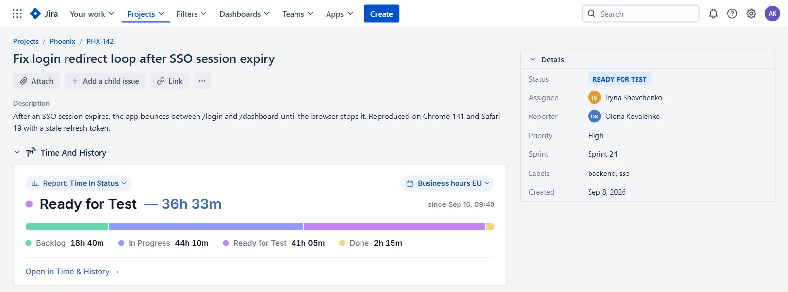
The caption row holds two chips: Report: and the working-hours calendar. Under them comes the headline for the issue, then the body of the chosen report.
| Report | Headline | Body |
|---|---|---|
| Time in Status | the status the issue is in now and how long it has been open there | a bar plus a legend of every status it passed, with the working time in each |
| Assignee Time | the current assignee and how long they have held it | one bar split by assignee, with an Unassigned band for time nobody owned |
| Time to Resolution | the working time to resolution — or Open and the time since creation | one band per resolution pass, with Created, Resolved and Reopens under it |
| Time in Changes | the change count across the fields you track, for example 12 changes · in 5 fields | one row per field with its number of changes and the time in the current value |
| Transition Count | the totals, for example 9 transitions · 5 pairs | one row per status pair, A → B ×n |
Lists are capped at five rows with a +N more line under them, so the panel never grows into the page. The fields listed by Time in Changes are the ones you selected in History by Fields, limited to those that actually changed on this issue.
The calendar pill
The second chip picks the work calendar the panel counts against. It writes the same personal setting as the Working hours control on the report pages, so the panel and the report can never disagree about an issue: change it in one place and the other follows. A site with a single calendar shows its name as plain text.
Working hours apply here exactly as they do in a report: time outside them is not counted, so a status entered twenty minutes ago at night reads 0h 0m. Transition Count is the exception — it counts events, so the pill reads Counts, not working hours and no calendar applies.
Open in Time & History
The link at the foot of the panel opens the full report for that issue: the header arrives in JQL mode on key = THX-142, with your own filter chips paused beside it, and on the same report the panel was showing. One step back in the browser restores the scope you had — the jump is never saved over it.
Who sees the panel
Anyone logged in to Jira can add it, and it shows an issue only to somebody who can already open that issue — the history is read with the viewer’s own Jira access. If the app is not enabled for your groups (see Access Settings), the panel says so in one line instead of redirecting you out of the issue.
Work calendars: exclude weekends and holidays
Work calendars define what counts as working time. Every duration in every report and gadget is computed against the active calendar: non-business days are excluded, only the configured work hours count, and holidays that fall on business days are subtracted.
Each calendar consists of:
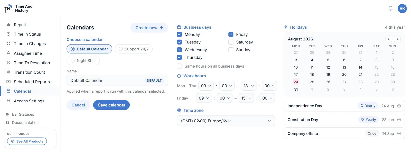
- Name — up to 25 characters;
- Time Zone — the IANA time zone the calendar operates in;
- Business days — seven weekday checkboxes, plus the Use the same work hours on all business days toggle;
- Work Hours — one shared range (for example 09:00 – 17:00), or an individual range per weekday when the shared toggle is off;
- Holidays — picked on a mini calendar with a description; a holiday can be set to repeat every year (shown with a Yearly label) and can be removed at any time.
A Default Calendar (Monday–Friday, 09:00–17:00, GMT) is created automatically. Create a calendar per team, office or support rota — support and engineering can each measure time against their own schedule. A calendar you no longer need can be deleted from the Calendars page.
The active calendar is a personal setting. Every user picks theirs in the report controls; the choice is stored on the server against your Jira account, so it survives sessions, browsers and devices, and it applies at once to every report that measures time — Time in Status, Assignee Time, Time to Resolution and Time in Changes — and to every dashboard gadget you look at. (Transition Count counts transitions rather than hours, so it is the one report a calendar cannot change.) It is never per report and never per gadget, and switching it never changes what anyone else sees. Until you pick one, you get the default calendar. One consequence worth knowing on a shared dashboard: the same gadget is computed with each viewer’s own calendar, so two people can read different durations from one card.
Calendars are managed on the Calendars page or directly from the calendar selector on any report. If you leave the editor with unsaved changes, the app asks whether to save or discard them.
Export reports to Excel (XLSX), CSV or PNG
All five reports — Time in Status, Assignee Time, Time to Resolution, Time in Changes and Transition Count — export to XLSX and CSV. PNG is a picture of a chart, so it is offered on any report while its chart mode is open. Exports run in the background and always cover all issues matching the current filter, not just the visible page.
- Set up the report — project, filters and calendar — exactly as you want it in the file. The time format and the column selection apply to the screen only: the file always writes durations as 1h 43m and always carries the same four issue columns.
- Open the Export menu (the export button in the controls row) and pick MS Excel Report (.XLSX) or Plain Text Report (.CSV); in chart mode, Chart Image (.PNG) is offered as well.
- Keep working. The export is queued and built in the background; you can change filters or leave the page.
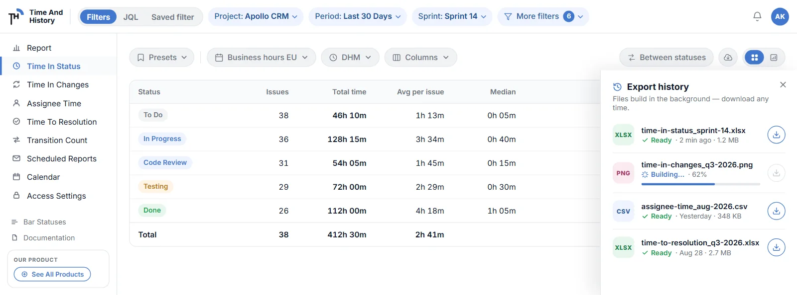
- Download from Export history. When the status turns to Success, download the file from the Export history panel.
| Format | Contents |
|---|---|
| MS Excel Report (.XLSX) | The report table as a worksheet — one row per issue under a fixed set of issue columns (Issue Key, Issue Type, Summary, Assignee), then the report’s own columns and Total, an entry-count twin of each status column (In Progress (entries)) and any Between Statuses pair columns. Time in Status, Assignee Time and Time to Resolution always add a Chart Data sheet of totals and percentages per series, and Transition Count a Totals sheet instead, because its Issues sheet carries no totals row. Exporting from chart mode adds one more sheet with the chart images; a scheduled run has no browser, so its workbook has none. |
| Plain Text Report (.CSV) | The same table in CSV, ready for spreadsheets and scripts — Between Statuses pair columns included. |
| Chart Image (.PNG) | A snapshot of the chart currently on screen. Offered on any of the five reports, and only while its chart mode is open. |
Export history keeps your 20 most recent exports with live progress and status (In Queue, In Progress, Success, Failed). Finished files can be downloaded or deleted at any time; exports are private to the user who created them.
Scheduled runs land in the same list, in the schedule owner’s history, so a daily schedule fills those twenty slots faster than hand-started exports alone. A scheduled file is always an XLSX, and its name carries the word Scheduled; the list itself does not mark it in any other way.
Access Settings
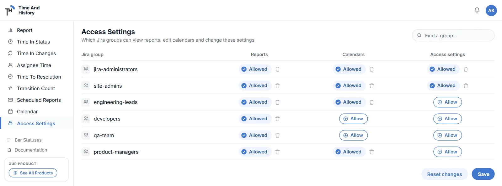
The Access Settings page controls which Jira groups can open each part of the app. Access is granted per group across three areas:
- Report — the report pages, the dashboard gadgets and the Scheduled Reports page: whoever may open the reports may schedule one;
- Calendars Settings — creating, editing and deleting work calendars;
- Permissions Settings — the Access Settings page itself.
Grant access with the Add … buttons, revoke it with the trash icon, then press Save. Reset Changes restores the last saved state. A granted cell shows a green Done chip.
- Jira admin groups (
jira-administrators,administrators,site-admins,system-administrators,atlassian-addons-admin,org-admins) always keep full access and cannot be revoked; - groups that were granted access but no longer exist in Jira are marked Unavailable — their grants can still be revoked;
- users without access to a page see a permission error and are asked to contact their Jira administrator.
Appearance & dark mode
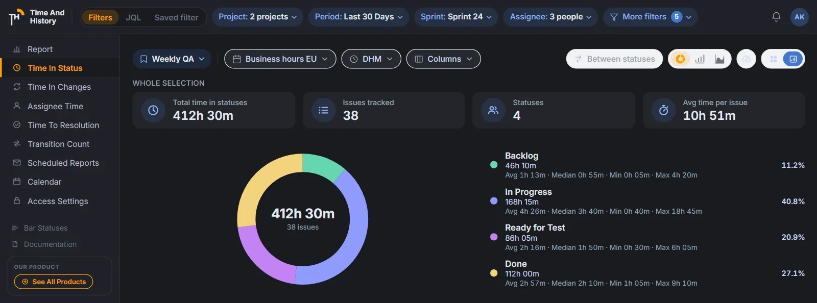
- Follows the Jira theme. Reports, gadgets and settings pages switch between light and dark automatically with the theme you set in Jira (your profile → Theme: light, dark or match system). There is nothing to configure in the app — the in-app theme switcher was retired in 2.2.0, and every report, chart, table and dialog is tuned for both themes;
- Collapsible sidebar — pin the navigation open or unpin it to a compact icon bar that expands on hover; the choice is remembered.
Data & security
- Reports and gadgets are computed on the fly from the Jira REST API — issue data is read transiently, never copied: the app keeps no copy of your Jira issues beyond the export files you explicitly create;
- every Jira read runs as the current user, so existing Jira project permissions always apply — on dashboards as well as on report pages (the one exception is a scheduled run, below);
- the app stores only your preferences (filters, columns, calendar, format and Between Statuses choices), work calendars, access grants, schedule definitions with the recipient addresses their owner typed, export files you created and feedback ratings; gadget configuration is saved in the Jira dashboard item itself;
- every request between the app’s pages and its service is authenticated per request (hardened in 2.2.0);
- the app writes to Jira only when you act: saving the Edit issue dialog changes an issue; saving a gadget’s configuration stores it as a property of that dashboard item. Reports and gadgets never modify issues on their own;
- the 20 most recent export files are listed in Export history, private to their creator and deletable there; older files are removed on request. The files a schedule produced are listed the same way, in the owner’s history, and they stay after the schedule itself is deleted;
- a scheduled report leaves the tenant by email: the XLSX is sent as an attachment to the addresses the schedule owner typed, through the app’s mail provider on AWS;
- processor terms for your legal team: the Data Processing Addendum (GDPR Art. 28) and the Privacy Policy.
Whose Jira permissions apply
Since 2.3.0 every request the app makes to Jira is made as the person using it, on report pages and on dashboards alike. Two people running the same report on the same filters can therefore see different rows, and neither sees an issue their own Jira account cannot open. The app cannot widen anyone’s visibility, and access grants only decide who may open the pages at all (see Access Settings).
The exception is a scheduled report: the run collects as the schedule owner, so its recipients read the owner’s view of Jira rather than their own. Choose the recipients accordingly.
What’s new
2.4.0 — 20 September 2026
New
- Report scope in the header. Nine filter chips — project, period, sprint, assignee, issue type, epic, reporter, labels, components — with multi-select projects, on every report. See Report scope.
- JQL mode. Paste any JQL: highlighted, validated and counted before you apply; a wrong query shows Jira’s message. See JQL mode.
- Saved filter mode. Run any report on one of your Jira filters, read as you. Chips are paused, not cleared, while either is on.
- Presets. Save a view — scope, period, calendar, format, columns, status pairs — under a name and apply it in one click. 50 per person; schedules can use one. See Presets.
- Issue view panel. All five reports for one issue, with a calendar selector and a link to the full report. Add it from the Apps menu. See Time in Status on the Jira issue view.
- Scheduled reports show delivery. A bounced or spam-flagged address is marked on the run and the recipient; a schedule with no address left switches off. See Delivery status.
- Time in Changes counts custom fields — see History by Fields.
Fixed
- Issues that never moved show their creation status.
- Temporary Jira errors are retried instead of failing the request.
Upgrade
- No action needed. Existing schedules, gadgets, calendars and access grants keep working; the header opens in Filters mode with the filters you had.
Full release notes on the blog — what each change is for, and what did not change.
2.3.0 — 6 September 2026
New
- Scheduled reports. Any report by email, daily, weekly or monthly at a set time and time zone, to up to 10 recipients, with the XLSX attached and every run listed in Export History — see Scheduled reports by email.
- Between Statuses. Working time between any two statuses on Time in Status, up to 10 pairs, first exit or last exit, saved per user, in the table and in exports — see Between Statuses.
- Transition Count. A fifth report counting every status-to-status transition per issue, with totals and XLSX/CSV export — see Transition Count.
- Chart mode on all five reports — donut, bar and area, with bar and area grouped by day, week, month, quarter or year, or by Auto.
- KPI tiles above every report table (This page) and in chart mode (Whole selection) — see Charts & KPI tiles.
Improved
- Every Jira read runs as the viewing user, so a report shows only the issues that person can see — see Whose Jira permissions apply.
Fixed
- Holidays match the calendar’s own day, not UTC.
- Chart periods follow the calendar’s time zone, the same for every viewer.
- Changelogs longer than 100 entries are read completely in exports and scheduled reports.
- The session token is renewed after 15 minutes, so an open page keeps working without a reload.
Upgrade
- No action needed. Existing gadgets, calendars and access grants keep working; Transition Count and Scheduled Reports appear in the app sidebar.
2.2.0 — 3 September 2026
New
- Dashboard gadgets. Time in Status, Assignee Time, Time to Resolution and Time in Changes, each as a chart gadget and a (Table) gadget. Filters on the card, an inline donut / bar / area switch, KPI tiles and aggregate tables, per-status expansion in Assignee Time and an Open full report link — see Jira dashboard gadgets.
- Avg, Median, Min and Max per status in the footer of the Time in Status table — see Time in Status.
- Gadget previews in Jira’s Add a gadget picker, so you can tell the chart and table variants apart before adding one.
Improved
- Dark mode follows the Jira theme automatically; the in-app switcher is gone — see Appearance & dark mode.
- Your time format and column selection are saved and restored per user.
- A running chart job survives filter changes instead of starting from scratch.
Fixed
- The working-time calculation undercounted intervals spanning several days; totals in all reports are now exact to the calendar.
- Backend errors are shown as errors instead of empty results.
- Hardened API request authentication.
Upgrade
- No action needed. Gadgets added before 2.2.0 keep their configuration and keep working.
2.1.0 — September 2026
- Export to XLSX and CSV for all four reports, plus PNG chart images from Time in Status, with an Export history to download files later — see Export reports to Excel (XLSX), CSV or PNG.
- Work calendars can be deleted.
- Per-issue aggregate and table fixes in the reports.
- Contrast fixes in dark mode.
Get the app. Not installed yet? Install Time And History from the Atlassian Marketplace (free for up to 10 users) or read the Time in Status for Jira Cloud overview.
FAQ
- My report is empty. What should I check?
- Make sure a project is selected and the date range is not too narrow (try Any Days). Remember that you only see issues your Jira account can access.
- Why is a duration smaller than the wall-clock time?
- Durations count only working time from your active calendar. Time outside work hours, on non-business days and on holidays is excluded. Changing the time format does not change that number: HM, Decimal Hours, DHM and Decimal Days show the same calendar-aware working time in a different unit. The one thing to watch is that in DHM and Decimal Days a "day" is a 24-hour block of accumulated working time, not one business day. See Time formats.
- How do I set up a work calendar that skips weekends?
- Open Jira Settings → Apps → Time And History → Calendars (or the calendar selector on any report), create a calendar, and tick only the weekdays your team works. Set the work hours for those days, pick the time zone, add your holidays with "repeat every year" for fixed dates, and press Save. Select that calendar in the report controls: every duration is then counted only inside those hours, so weekends and holidays never inflate a number. See Work calendars.
- Where is the average per status shown, and over which issues?
- In the footer of the Time in Status table, which carries an Avg, Median, Min and Max row for every status column, for the total and for every Between Statuses pair column you added. Those statistics cover the issues on the current page of the table — the footer states which page — and an issue that never entered a status is not counted for that status. The KPI tiles above the table are captioned "This page" and cover the same rows; in chart mode they are captioned "Whole selection" and cover every issue the filters match. The table gadgets add an "Avg time per issue" tile computed over every issue matching the gadget filter. See Time in Status.
- How do I measure the time between two statuses?
- Open the Between statuses pill on the Time in Status report and add a pair: From, To and a mode. First exit measures from the first entry into the first status to the first entry into the second, so later loops are ignored; last exit measures to the last entry into the second status, so every loop counts. Each pair becomes a column of working time per issue, with its own Avg, Median, Min and Max in the footer, and it travels into XLSX and CSV exports and into a Time in Status schedule. Up to 10 pairs, saved for you on this site. See Between Statuses: time between two statuses.
- How many times did an issue change status?
- That is the Transition Count report: one row per issue, one column per status pair that actually occurred, and the number of times that transition happened — for example Ready for Test → In Progress: 3. A Total column sums each issue and a TOTAL row sums the issues on the page shown. It counts events rather than working time, so it has no work calendar and no time format, and it exports to XLSX and CSV. See Transition Count: how many times statuses change.
- How do I configure a gadget's project, period and chart type?
- Open the gadget menu on the dashboard and choose Configure (the gear). The form holds Project, Epic, Sprint, Assignee, Period (a preset or a custom range), Time format (on gadgets that measure time), View (Chart or Table) and Visualization (Donut, Bar or Area). Press Save — only people who can edit the dashboard can save, and the saved configuration is what every viewer sees. Viewers can still re-cut the card with the chips and the inline chart switch for their own session. See Jira dashboard gadgets.
- How do I run a report on a JQL query or one of my Jira filters?
- Use the Filters | JQL | Saved filter switch at the left of the report header. In JQL mode, type or paste a query of up to 2,000 characters: the editor highlights it, validates it against Jira and prints "Valid JQL · N issues match" before you apply, or Jira's own error message when the query is wrong. In Saved filter mode, pick one of the Jira filters you starred, own or had shared with you; the resolved JQL is shown read-only beside the chip. In both modes the server adds nothing to your query, so the count in the editor and the rows in the table agree, and your filter chips and period are paused rather than cleared. See Report scope: filters, JQL and saved filters.
- How do I save report filters and reuse them next week?
- Open the Presets pill at the left of the view bar and choose "Save current as…". The preset stores the scope, the period, the work calendar and the time format on any report, plus the columns (or History by Fields) and the Between Statuses pairs on the report it was saved on. Apply it in one click; when the view drifts the pill reads Modified and offers Update preset or Revert. Presets are personal, capped at 50 per person, and a schedule can take its filters from one. See Presets: save and reuse a report view.
- How do I see the time in status on a Jira issue itself?
- Open the issue, press Apps in the issue view and add Time And History. The panel appears under the description with the status the issue is in now and how long it has been there, a bar and a legend for every status it passed, a Report chip that switches between all five reports, a working-hours calendar selector and a link that opens the full report on that issue. The panel is added per issue from the Apps menu — once somebody adds it, everyone who opens that issue sees it; it never appears on its own — and it never writes to the issue. See Time in Status on the Jira issue view.
- A scheduled report did not arrive. How do I tell?
- The Scheduled Reports list shows it. A recipient whose address bounced or marked the mail as spam gets a red ring with an exclamation mark on the avatar, and the run carries a red sub-line — "Not delivered to [email protected] (mailbox does not exist)". A run that reached some recipients stays Success; if every address on a schedule is undeliverable, the run fails and the schedule is switched off with that reason on the row. There is no retry to a bounced address: remove it from the recipients and save the schedule again. See Delivery status: bounces and spam complaints.
- How do I send a Jira report by email on a schedule?
- Set the filters on a report page first, then open Scheduled Reports in the app sidebar and press New schedule. Give it a name, pick one of the five reports, choose Daily, Weekly or Monthly with a start date, a start time and a time zone, and type up to 10 recipients — nobody is added implicitly, not even you. The filters are frozen when the schedule is created; to change them, create a new schedule or, for a schedule built from a preset, re-take the preset's current filters. Every run mails an XLSX, attached when the file is 7 MiB or smaller, and appears in your Export History. See Scheduled reports by email.
- How do I download an export from Export history?
- Open the Export menu in the report controls and pick MS Excel Report (.XLSX) or Plain Text Report (.CSV); in chart mode, on any of the five reports, there is also Chart Image (.PNG). The file is built in the background, so you can keep working. Open the Export history panel, wait until the status turns to Success, and click the file to download it. Your 20 most recent exports stay in the list — scheduled runs are in the same list — and you can delete any of them. See Export reports to Excel (XLSX), CSV or PNG.
- Who can open the reports?
- Any user whose Jira group has the Report grant in Access Settings; the same grant opens the Scheduled Reports page. Jira admin groups always have access. Beyond that, every Jira read runs as the person viewing the report, so a report shows only the issues that user can already open in Jira.
- Does the app change my issues?
- The app writes to Jira only when you act. Saving the Edit issue dialog changes an issue; saving a gadget's configuration stores it as a property of that dashboard item. Reports and gadgets never modify issues on their own.
- Can different teams use different work schedules?
- Yes — create a calendar per team (each with its own business days, hours, time zone and holidays) and let every user pick theirs in the report controls. The pick is personal and remembered: it applies to every report that measures time — Time in Status, Assignee Time, Time to Resolution and Time in Changes — and to that user's dashboard gadgets, and it leaves everyone else's numbers alone. Transition Count counts events rather than hours, so no calendar changes it.
Still have questions? Write to [email protected] — we are happy to help.