
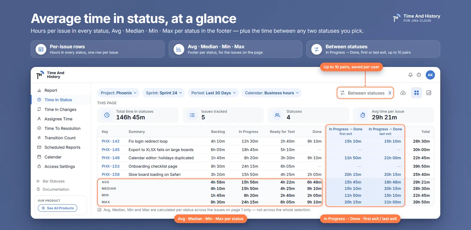
You put the average review time on the retro slide, and someone asks which issues are in it. That is the moment the number either holds or it does not — and most averages do not, because one issue stuck in review for six weeks can double the mean while the median barely moves. A Jira average time in status is stored nowhere: Jira records status changes, not durations, so the average exists only once something computes it, and whatever computed it made four decisions on your behalf. The short answer: Jira's own Average Time in Status gadget charts a calendar-day mean over the issues resolved in the window; a report that reads the changelog gives you the average, the median, the min and the max per status in business hours, with the issues that produced each number still on screen. This is what the mean hides, which of the four summary numbers has which job, and the question most reports never answer out loud: which issues each number covers.
Why the mean is the wrong one number
A table with a row per issue and a column per status answers the question precisely — and nobody reads it in a standup. What gets asked for is one number per column, small enough to fit in a sentence, stable enough to compare against last quarter. The problem is that "average" almost always means the arithmetic mean, and status durations are close to the worst possible input for a mean.
Time in a status has a hard floor at zero and no ceiling. Most issues clear a review column in hours; one — call it PROJ-478 — waits weeks for a security sign-off that involved a different department and two time zones. Distributions like that are skewed right, and on a right-skewed distribution the mean sits well above the typical value — it is not describing any issue you actually shipped.
Five issues pass through In Review with working times of 4h, 5h, 6h, 7h and 322h, the last of them PROJ-478. The mean is 68h 48m. The median is 6h. One of those numbers describes four issues out of five; the other describes none of them.
At a more realistic scale — a report filtered to one project and one quarter, 58 resolved issues — the effect looks like this:
| Status | Issues that entered | Average | Median | Min | Max |
|---|---|---|---|---|---|
| To Do | 58 | 9h 40m | 7h 10m | 12m | 39h 00m |
| In Progress | 58 | 13h 25m | 11h 50m | 1h 05m | 38h 30m |
| In Review | 57 | 21h 50m | 6h 40m | 4m | 322h 00m |
| Blocked | 14 | 19h 30m | 8h 20m | 55m | 88h 00m |
Remove PROJ-478's 322-hour row from In Review and the average falls from 21h 50m to about 16h 30m — a quarter of the number gone with one row. The median moves from 6h 40m to 6h 35m. A summary whose value depends that heavily on one issue is not a summary of the process; it is a summary of that issue.
Two other things in that table deserve a look before any of it goes on a slide. The Blocked average is an average of fourteen issues, not fifty-eight. The report does not print that count next to the average — you get it by counting the cells in the column that are not a dash, because a status an issue never entered shows - rather than a zero. Count it before you quote it, or the number will be read as a property of the whole quarter. And a four-minute minimum in In Review is not a fast review; it is an approval, or an automation, and it is quietly pulling the average down.
Four decisions that change the average
Before comparing your average with anyone else's — another team, a benchmark, last quarter — it is worth knowing which four decisions produced it. Different tools decide differently and produce different numbers from the same project; what is not defensible is quoting a number without knowing which decisions are inside it.
The still-open interval. An issue that entered review twelve days ago and is still there has no closing transition, so its interval either runs to "now" or gets dropped. Dropping unfinished intervals biases the average low at exactly the wrong moment — the long-running issues are precisely the ones that have not finished yet. Counting to "now" is more honest but makes the number drift upward day by day with no transitions happening at all. Time in Status counts the current interval up to the moment the report runs; if your previous tool dropped open issues, expect the averages to rise when you switch, and expect them to be more truthful.
Issues that re-enter a status. An issue that bounced between In Progress and In Review three times spent, say, three separate 2-hour visits in review. A per-status total records 6 hours; an average over visits records 2. The two conventions diverge exactly when rework is common — which is usually when someone starts asking for the number. Totals per issue are the safer default: they answer "how much review did this issue consume" rather than "how long is a review sitting". If what you actually want is the count of those visits, that is a different report — Transition Count counts how many times each status pair occurred instead of how long it lasted.
Weekends and working hours. A review requested at 18:40 on Friday and finished at 09:10 on Monday lasted ten minutes of working time on a 09:00–17:00, Monday-to-Friday calendar — and sixty-two and a half hours on the wall clock. Apply that choice to every interval in a quarter that crosses a weekend and one clock is reporting a number hundreds of times larger than the other. A work calendar — business days, working hours, time zone, holidays — is the difference between an average the team recognises and one they argue with; what a work calendar changes in your numbers works one interval through both clocks. Whichever clock you choose, every number you compare against has to be on the same one.
The reporting window. "Average review time in Q3" still needs a definition: issues created in Q3, resolved in Q3, or merely in review at some point during Q3? Resolved-in-period is the most stable — every interval is complete — but it lags, because a slow issue lands in the quarter it finished, not the quarter it was slow in. Created-in-period reflects recent intake but is dominated by open intervals. The date filters in Time in Status apply the same preset to created, updated or resolved explicitly, which at least makes the choice visible rather than implicit.
What Jira gives you natively
Jira Cloud has an Average Time in Status dashboard gadget, and for a single number on a wall it may be enough. It plots a line: for each day in the window you configure, the average time that issues resolved that day had spent in the statuses you picked — a scope Atlassian's suggestion tracker (JRACLOUD-77733) and consistent community reports agree on. Calendar days, mean only, and nothing at all about work still open. One more thing is worth knowing before you configure it: the status picker lists every status on the instance rather than the ones in your project's workflow. The tracked bug, JRACLOUD-77503, was closed after the list was deduplicated and alphabetised, and statuses from every other project on the site are still in it. If a dashboard tile is where the number has to live either way, a Time in Status gadget puts the same per-status working time on a board, on your work calendar.
The Control Chart in board reports takes the opposite approach: instead of one number it plots every issue's elapsed time between two columns with a rolling average and a variation band. It is board-scoped, it aggregates by column mapping rather than by status, and the rolling average is a trend line — useful for "are we getting slower", nearly impossible to quote as "our average review time is X". Teams bounce off it not because the chart is wrong but because it answers a different question than the one being asked.
The third route is the manual one: export the per-issue status times and compute AVERAGE, MEDIAN, MIN and MAX yourself. For a single retro or a single question it is the right answer, and it forces the four decisions above into the open. What it cannot carry is the part that makes the number defensible: business hours against a calendar with holidays and a time zone is not a spreadsheet formula, still-open intervals have to be judged row by row, and re-entries have to be summed per issue by hand. Note what the route starts with, too — a per-issue export, which is the report doing that arithmetic first. After that the costs are the usual ones: the file is stale the moment it is downloaded, and next month someone repeats the exercise slightly differently and gets a different number with the same name. The export walkthrough covers the mechanics; exporting from Time in Status gives you the file to start from.
Two of those three routes need an owner. The gadget is configured per dashboard, and re-picking statuses from a site-wide list is a job again every time somebody rebuilds the wall. The spreadsheet is redone every month by whoever did it last, and it is a different spreadsheet each time. A report read from the changelog needs neither: no rule to keep running, no custom field to protect from the next workflow edit, nothing to hand over when the person who set it up goes on leave. It reads history Jira already stored, which is also why last quarter is on screen this afternoon rather than a quarter after you switch something on.
How to calculate average time in status in Jira
Jira has no stored duration to read, so every route has to compute one. In Time And History, a Time in Status app for Jira Cloud, the computation is the report, and getting to the four numbers takes about a minute.
- Run Time in Status on one project and one period. From the Jira top bar, Apps → Time And History, then Time in Status. Set the project, the sprint or epic and the date range, and let the table load.
- Set the work calendar before you read anything. Business days, working hours, time zone and holidays decide what an hour means here, and the rows and the summary underneath them are computed on the same calendar — change it and both move together.
- Read the footer. Avg, Median, Min and Max sit under every status column and under the total, in the same time format as the cells above them.
- Switch to chart mode for the wider reading. The same four KPI tiles recompute over every issue the current filters match rather than the page you were on.
- Export or schedule it when the number has to leave the screen. An export covers every issue the filters match; a scheduled report mails the same XLSX daily, weekly or monthly.
Which issues the Jira average time in status covers — and how to prove it
In Time And History the average sits in three places on the Time in Status report, and they do not all cover the same issues. That is the sentence most reporting tools leave out, so it goes first:
- The table footer — Avg, Median, Min and Max, per status column and for the total — covers the issues on the page you are reading: fifteen rows a page, and the footer names the page it covers. A status an issue never entered shows
-rather than a zero, and that row stays out of that status's four numbers. - The KPI tiles above the table — Total time in statuses, Issues tracked, Statuses, Avg time per issue — carry the caption This page, and the tooltip spells it out: calculated across the issues on this page only, not across the whole selection. (Statuses counts the status columns in the report, not issues.)
- Chart mode computes the same four tiles over the whole selection — every issue the current filters match — and the caption changes to Whole selection to say so. The charts themselves have always aggregated over the selection rather than the page.
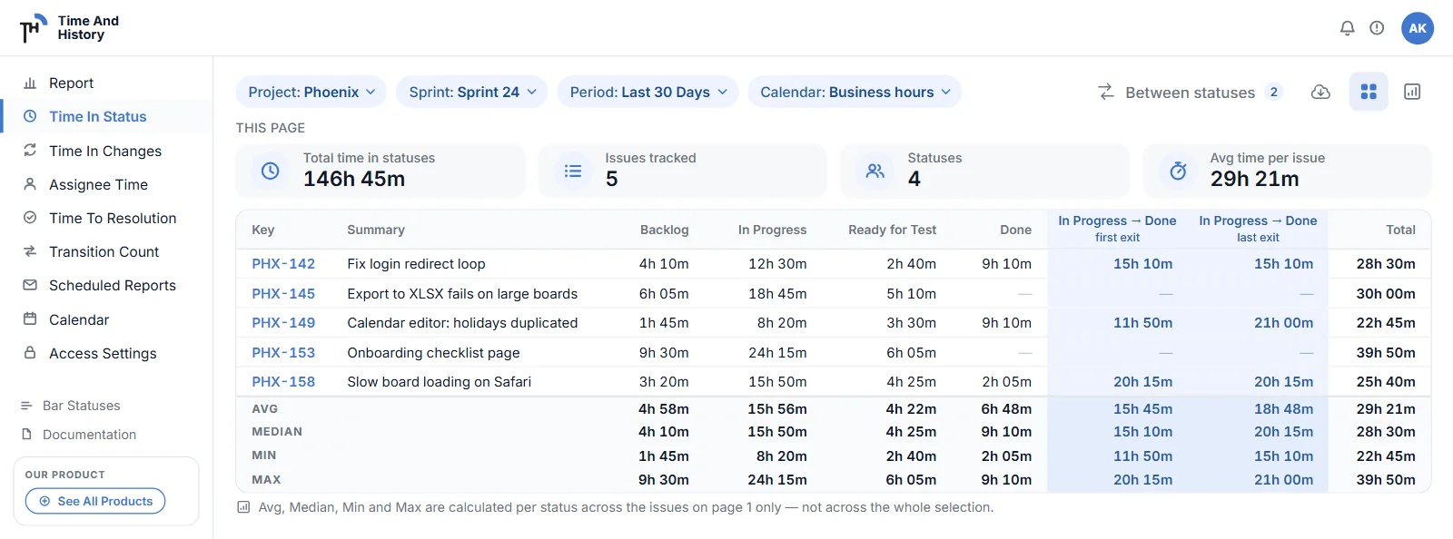
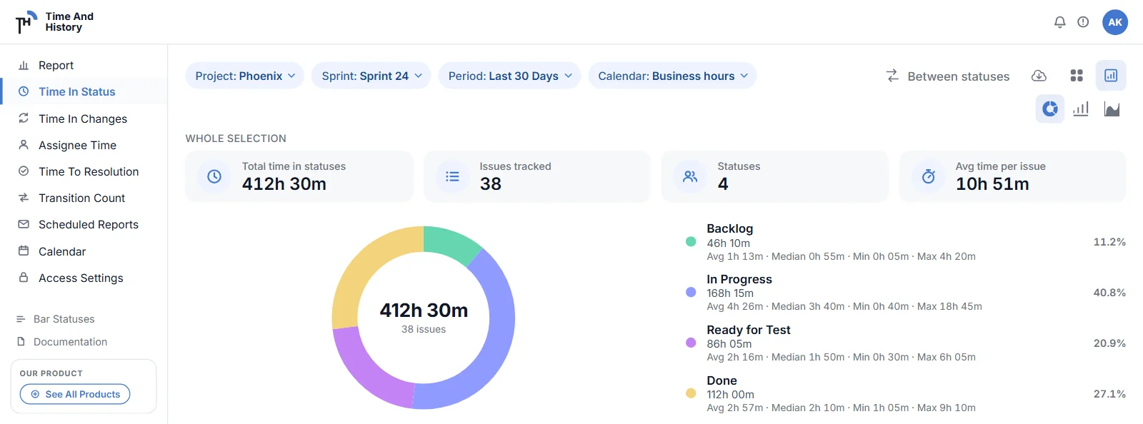
One property matters more than the arithmetic: the per-issue rows stay visible under the summary. When the In Review average reads 21h 50m against a 6h 40m median, the issue responsible is in the same view, a scroll away — because an average you cannot decompose into the issues that produced it is an average you cannot defend in the meeting where someone asks "which issues, exactly?"
For a whole-filter file rather than a whole-filter screen, an export runs over every issue the current filters match, not the visible page — so the workbook is the wide view even when the footer you were reading was not. The machinery underneath all of this is described in the Time in Status report walkthrough — transitions paired into intervals, the implicit first interval from issue creation, statuses an issue never visited shown as - rather than zero. The summary adds a distribution view on top without changing any of it.
And one average that is not a per-status average at all. Pick two statuses on Time in Status — In Progress → Done — and Between Statuses adds a column of working time per issue, with its own average, median, min and max in the footer. Choose first exit, which ignores later loops, or last exit, which counts every one. Up to ten pairs, saved for you, and the columns travel into exports. It answers "how long from A to B" with two statuses you named rather than a metric the app named for you — the walkthrough works both modes through on one reopened issue and reads the footer under them.
Four questions to ask any tool that hands you an average
Every status-duration report will give you a mean. The mean is not the product; the ability to defend it is. Before you standardise on one, open it and check:
- Does it show the median beside the mean, or only the mean? One number on its own cannot tell you whether it describes the team or describes PROJ-478.
- Does every summary say which issues it covers, on the summary itself? Here the caption above the tiles reads This page or Whole selection, rather than living in a help article.
- Can you recompute the footer from the rows in front of you? That is the whole difference between a number you quote and a number you defend.
- Is it counting your working hours or the calendar's? A weekend is most of the gap between the two, and the gap is not small.
If somebody has already asked you "which issues, exactly?" — and they will — that is a one-minute reading on last week's sprint, not a project. Time And History is free for up to 10 users.
Which number to quote
Each of the four numbers has a job, and most reporting mistakes come from giving one of them another number's job.
- Median, for expectations. "Half of our issues clear review within 6h 40m" is a sentence you can say to a stakeholder and still stand behind after the next outlier. It is the number to track week over week, because it moves when the typical experience moves and stays put when one issue gets stuck.
- Max, for conversations. Every max is a story — a dependency, an absence, a decision nobody owned. One max per status per week is a short reading list, and it is where the actual process improvements hide. Averaging the outliers away is how they survive.
- Average, for totals. The mean earns its keep when you multiply it back out: average times issue count is total time consumed, and totals are what capacity discussions need. Quote it for cost, not for expectations.
- Min, for hygiene. A minimum measured in minutes usually means an automation, a self-approval, or a column being skipped — worth knowing before it flatters the average.
And when you compare, compare like with like: the same filter, the same calendar, the same window convention, the same scope, quarter against quarter. A median on working hours against last year's mean on calendar days is not a trend — it is two unrelated numbers on one chart.
Jira average time in status FAQ
How do I calculate average time in status in Jira?
Jira stores status transitions, not durations, so something has to pair each transition with the next, attribute the interval to a status, sum per issue, and average across issues. The native routes are the Average Time in Status dashboard gadget and the Control Chart; the manual route is exporting per-issue status times and using AVERAGE and MEDIAN in a spreadsheet; a Marketplace report does that pairing for you against the live changelog. They do not all do it the same way. The one to standardise on shows the median, min and max beside the average, states which issues each summary covers, and leaves the per-issue rows underneath it — because an average you cannot decompose into the issues that produced it is an average you cannot defend. The five steps for doing it that way are in the how-to section above.
Does Jira have an average time in status gadget?
Yes — Jira Cloud ships an Average Time in Status dashboard gadget that charts an average for selected statuses over a trailing window. Know its limits before relying on it: its scope is issues resolved in the window, so a growing queue of open work stays invisible; the results are calendar days with no business-hours awareness; it reports the mean only; and the status picker lists every status on the site rather than your project's workflow.
Why is my average time in status so much higher than the median?
Because status durations are right-skewed: bounded at zero below, unbounded above. A handful of stuck issues pull the mean up while the median — the middle issue — barely notices. A large gap is not a measurement error; it is the distribution telling you to go read the max values instead of the average.
Does the average cover every issue in my filter, or only the page on screen?
Both, in different places, and the report says which. The Avg/Median/Min/Max footer and the KPI tiles above the table cover the page you are reading — the tiles are captioned This page. Chart mode recomputes the tiles over the Whole selection, every issue the current filters match, and an export covers the whole selection too. Read the caption before you quote the number.
Is average cycle time the same as adding up average time in status?
Only under one convention. Means are additive, so per-status averages sum to the average total time — but only if every status average is computed over the same set of issues, counting zero for issues that never visited. Most reports, including ours, average each status over the issues that actually entered it, and under that convention the per-status averages do not sum. Time And History publishes no cycle-time metric of its own, deliberately — a vendor's metric is a definition somebody else wrote, and the first thing a team does with it is argue about whether it applies to them. What the report publishes is working time between two statuses you named, on your calendar, with the loop rule printed in the column header. If your team has a name for that number, the name is yours and so is the definition, which is the only version that survives a retro. If the interval you mean runs from creation to resolution, Jira time to resolution measures that one on the same clock.
Does average time in status include weekends?
It depends entirely on the tool's clock. Wall-clock tools count the weekend; calendar-aware tools count only configured business hours. In Time And History the active work calendar — business days, hours, time zone, holidays — drives both the per-issue durations and the summary statistics, so the average and the rows beneath it always agree on which hours counted.
Can the average be emailed to people who never open Jira?
Yes. Set the filters on the report page, then create a scheduled report: daily, weekly or monthly, at the start time and time zone you choose, with the filters frozen as you set them. The XLSX arrives as an attachment to up to ten recipients you type yourself, and every run is listed in Export History. A scheduled run collects as the schedule owner, so recipients see the owner's view of Jira.
What does this cost?
Time And History is free for Jira sites with up to 10 users — the Avg, Median, Min and Max footer, the KPI tiles, chart mode, exports and scheduled reports all included, with no separate tier for any of them. Larger sites are on the paid plan, which starts with a free trial from the Marketplace listing; the reports behave identically on both. Checked 6 September 2026 — the listing has the current terms.
Settle the average argument on last week's sprint
Open Time in Status on one project and one sprint, set the work calendar, and read the footer: Avg against Median, per status. Where the two are close, quote either. Where the average is three times the median, the Max on that same row names the issue to open — the PROJ-478 of your quarter — and it is on screen, not in another tool. Then switch to chart mode and watch the tiles change from This page to Whole selection: the same four numbers over every issue the current filters match. Those two readings, side by side, are what a retro argument actually needs, they take about a minute to produce, and nothing is left running afterwards for anyone to own.
Time in Status is one of five reports in Time And History for Jira Cloud — Assignee Time, Time to Resolution and Time in Changes are the others, all counted in business hours against your work calendar, plus Transition Count, which counts status changes rather than hours. Install it from the Atlassian Marketplace and read Avg against Median on the sprint that closed last week — free for up to 10 users, so the first team can try it without a purchase order. The charts and KPI tiles documentation has the rest of the rules. Verified 6 September 2026.