
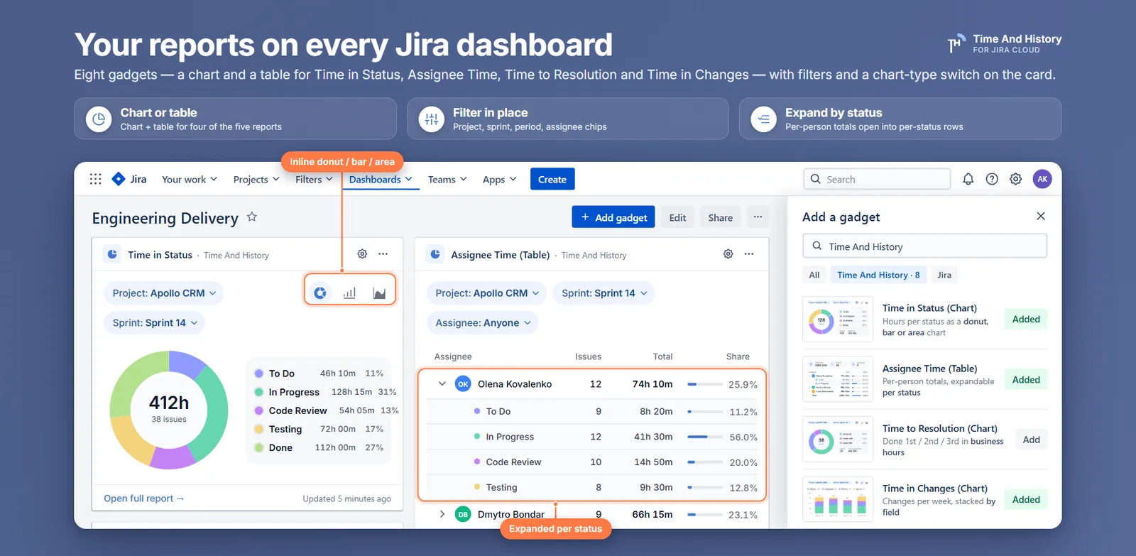
Your team lead knows where the review bottleneck is. She opens the time-in-status report every Monday, sets the filters, reads the numbers — and the week she is on holiday, nobody else in the room can say where the time went. The answer lives in a sequence of clicks rather than on a wall, so the question does not stop being asked; it just stops being answered.
A Jira time in status dashboard gadget is how that answer stops depending on one person. The short answer: Jira's native gadgets count calendar time over issues that have already resolved, so the work actually stuck right now is invisible to them; a gadget that reads the issue history against a work calendar puts working time per status on the dashboard instead — recomputed on every load, for the project, epic or sprint you point it at, open issues included. Time And History adds a chart gadget and a table gadget for each of its five reports. This covers what native gadgets can and cannot answer, how to add one in four steps, chart versus table, and the decisions that keep the wall being read in November.
What a Jira time in status dashboard gadget has to do
A report answers a question for the person who runs it. A dashboard answers it for everyone who did not — for as long as the number survives being questioned. Once a number has been successfully challenged, the dashboard it lives on is dead: people go back to asking the team lead, and you are back to the Monday routine.
So the bar is not a chart. It is this: the number is visible before anyone asks for it, it is current without anyone rebuilding a filter, it counts the work that has not finished yet, and it means the same thing to everyone who reads it. A gadget that needs interpretation is a report with extra steps.
How to add a Time in Status gadget to a Jira dashboard in four steps
Time And History puts a chart gadget and a table gadget on a dashboard, and every report gets the same pair — Time in Status, Assignee Time, Time to Resolution, Time in Changes and Transition Count; Between Statuses stays on the Time in Status report page. Adding a gadget takes four steps:
- Open the dashboard you want it on and click Edit. You need edit rights on that dashboard.
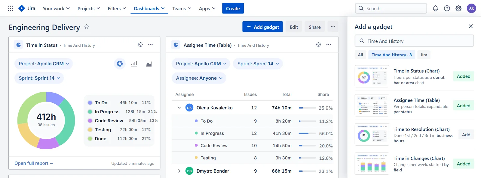
- Click Add gadget and search for Time And History. The picker lists the app's gadgets with a preview of each.
- Pick the chart or the table. Time in Status adds the chart; Time in Status (Table) adds KPI tiles and a table. Every other report has the same pair.
- Configure and save. Open the gear, choose at least a project, then save and leave the dashboard's edit mode.
The gear holds a subset of the report page's filters: Project, then Epic, Sprint and Assignee as optional narrowing, a Period (the report presets, or a custom range picked on a calendar), the Time format (on gadgets that measure time), the View — Chart or Table — and the Visualization — Donut, Bar or Area. That configuration is saved on the gadget instance and is what everyone who opens the dashboard sees. Only people who can edit the dashboard can save it.
One thing the gear does not hold is a period grouping. Bar and area gadgets bucket the period automatically, while the same two charts on the report page let you pick day, week, month, quarter or year — which is one more reason every card carries an Open full report link to the page behind it.
Nothing runs after that. The gadget is computed from Jira's issue history every time the dashboard loads, so there is no automation rule to keep alive, no custom field a workflow edit can orphan, and no scheduled job to notice has quietly stopped. The first load can take a few seconds while the report is computed; after that the card carries an "Updated 5 minutes ago" label, so nobody has to wonder how old the number is. The card cannot go stale, and it cannot go on holiday.
Four steps, and nothing left running afterwards. If the Monday report already exists, the gadget is that same filter on a wall — worth trying on last sprint's dashboard before the next planning meeting. Time And History is free for Jira sites with up to 10 users, so the first team can put one up without a purchase order. The full field list is in the dashboard gadget documentation.
Chart gadget or table gadget: which one ends the argument faster
The chart gadget answers where does the time go at a glance. It aggregates working time per status over every issue matching the gadget's filters — the same whole-filter aggregation as the report's charts and KPI tiles, not a sample and not only resolved issues — and renders it as a donut, a bar chart or an area chart.
Take a two-week sprint of 34 issues. The donut comes out Code Review 41%, In Progress 27%, Waiting for Customer 19%, To Do 9%, Testing 4%, and the standup argument moves from "we are slower this sprint" to "review is where the sprint went" in one look, without anyone opening a report.
The table gadget answers how much, exactly. It opens with four KPI tiles over an aggregate table of four columns — Status, Issues, Total and Share — one row per status, and a Total row underneath. The Share column is the donut's ring written as percentages, which is what makes the table twin quotable. On a Time in Status gadget the tiles read Total time in statuses, Issues tracked, Statuses and Avg time per issue; the last two follow the report — Assignees on Assignee Time, and Fields with Avg changes per issue on Time in Changes, which counts changes rather than hours.
Since version 2.3.0 the report pages carry KPI tiles as well, and the difference is scope: a gadget's tiles cover its whole filter, while the tiles above a report table are captioned This page and cover only the issues in front of you — in chart mode the caption changes to Whole selection.
Two rules of thumb. A workflow with four or five statuses reads well as a donut; a twelve-status workflow does not, and belongs in the table twin. And if the question is about people rather than statuses, the Assignee Time (Table) gadget expands each person into per-status rows, which is the fastest way to see where the workload per assignee is actually landing. The Time to Resolution pair is the one to add when the wall also has to carry the created-to-resolved number an SLA conversation turns on.
How gadget filters work on a shared Jira dashboard: safe to touch
The fastest way to kill a shared dashboard is to make people afraid to touch it. Every gadget shows its current Project, Sprint, Period and Assignee as chips on the card, and chart gadgets add an inline donut / bar / area switch next to them. Both are yours alone: changing a chip or the chart type re-cuts the gadget in your browser session only, it is not written back to the dashboard, and a reload restores what the gear has saved. So a viewer can answer a follow-up question on the spot without disturbing the wall for everyone else. Epic is the one filter that lives only in the gear.
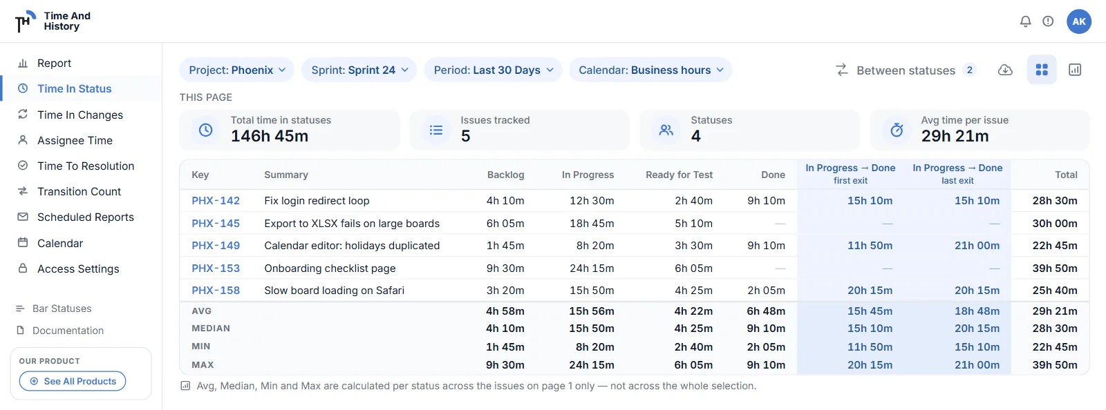
The other link that matters is at the bottom of the card. Open full report opens the matching report page with the gadget's filters already applied, so the per-issue table and the export are one click behind the dashboard. From a Time in Status gadget you also land on its Avg, Median, Min and Max footer for the issues on the current page — chart mode is on all five reports, but that footer is Time in Status's own. Nobody has to rebuild the filter to drill in, which means the drill-in actually happens.
Why native Jira gadgets cannot show time per status in business hours
One question arrives as soon as the card is on the wall: could Jira have done this?
Jira Cloud has a gadget named for the job, and it is the first thing people try. The Average Time in Status gadget plots a line chart: for each day in a chosen window, the average time that issues resolved on that day had spent in the statuses you selected. Atlassian publishes no configuration reference for it, so that scope comes from its suggestion tracker (JRACLOUD-77733) and consistent community reports rather than from a spec — worth knowing before you quote it. What the mean hides in a Jira average reads the number it charts.
Three properties of that design decide what it can answer. Only resolved issues count: an issue that has been sitting in Blocked for three weeks contributes nothing until the day it finally resolves, at which point it lands in one day's average and produces a spike. The grouping is by resolution day, not by cohort: ten issues resolved on the same Tuesday are averaged together regardless of when they were created or how different their paths were, so on a quiet day a single old issue owns the data point. And the status list is instance-wide: the dropdown offers every status on your Jira site rather than the statuses of the project you just selected. Atlassian tracked that as JRACLOUD-77503 and closed it — the fix sorted the list alphabetically and removed duplicates, but every status on the instance is still there, so if your team's In Review shares a name with another team's, you get to guess.
Two neighbouring gadgets are often suggested as substitutes, and neither is one. Sprint Health is a snapshot of the active sprint — progress by estimation, flagged issues, scope change — so a sprint can look healthy while every issue in it spends two-thirds of its life waiting for review. Filter Results can only show fields Jira stores, and Jira does not store time in status: the history records transitions, and durations exist only once something computes them, which is how a Time in Status report is built.
| Gadget | Answers well | Cannot answer |
|---|---|---|
| Average Time in Status | Trend of average time in selected statuses, over resolved issues | Anything about unresolved issues |
| Sprint Health | Is the active sprint on track by estimation | How long work sits in any status |
| Filter Results | Which issues currently match a filter | How long they have matched it |
Put the three together and the hole is still the question that started the dashboard: for this team, this epic, this sprint — how much time went to each status, counted in working hours? That question has three requirements, and every native gadget fails at least one:
- Time per status, including open issues. The bottleneck is in the work that has not finished. A view restricted to resolved issues shows you last month's problem.
- The unit somebody actually manages. "The project" is rarely it. The question is about one epic, one sprint, one person's issues, over a period — which is exactly the shape of a gadget's gear.
- A clock that skips nights and weekends. A ticket that entered Waiting for Customer on Friday evening and left on Monday morning waited either sixty-some hours or almost none, depending on the clock. A dashboard number that silently includes the weekend gets challenged the first time it appears in a meeting, and native gadgets count calendar time always — there is no setting that makes them aware of a working day.
There is one more alternative, and it is the one most teams are actually running: somebody opens the report, screenshots it, and pastes the picture into the wiki. That works, at a price paid every week. The filter is rebuilt from memory each time, so last month's picture and this month's are not reliably the same cut; the image is stale the moment it is pasted and nothing on it says how stale; and it stops entirely the week its owner is away, which is the failure this whole page is about. A gadget is that same query, computed on load, that nobody has to remember to run.
How to build a per-sprint or per-epic dashboard that survives the first month
A gadget that answers the question is necessary but not sufficient. None of what follows is maintenance — the card keeps computing whether or not anyone tends it. These are four decisions to take once, on the day the wall goes up, and each one is a way dashboards quietly die.
One question per gadget. A gadget pointed at a whole project with a twelve-status workflow answers nothing; it is a report squeezed into a tile. Narrow it — one epic, one sprint, one period — and add a second gadget for the second question. A per-sprint row of gadgets with a per-epic row underneath is a dashboard people can scan; one giant donut is not.
Let the chips do the caption. The card already states its Project, Sprint, Period and Assignee, so the scope of the number is legible without anyone having to ask.
Say which clock you are on. Each card is computed against the work calendar of the person reading it — business days, per-weekday hours, holidays, a time zone — which is why a team in Berlin and a team in Bangalore each read the wall in their own business hours rather than head office's. The trade is that two people on different calendars read one card differently, and both are right. Settle it the way you settle any shared unit: name the calendar the wall is quoted in the first time the dashboard is presented, the way you would name the currency on a revenue chart. It is a personal setting, not a property of the gadget, so this is one line in a team convention rather than a configuration anyone has to own.
Keep the units consistent across the wall. On gadgets that measure time, the time format is part of the saved configuration, so two neighbouring gadgets can perfectly well be read in different units. Pick one for the dashboard. HM, Decimal Hours, DHM and Decimal Days all show the same calendar-aware working time in different units — and be deliberate about the day-based two, since a "day" there means your calendar's working day, not twenty-four hours.
Three questions to ask any dashboard gadget before you put it on a wall
Most status-duration apps will put a card on your dashboard. The card is not the product; the ability to defend what it says is.
- Does it count the work that has not finished? The bottleneck is in the open issues. A gadget scoped to resolved work shows you last month's problem, confidently.
- Does it count business hours? A card that charges a Friday-evening hand-off for the whole weekend loses its first argument in a meeting, and the wall dies with it.
- Can a doubter get from the card to the rows? Here Open full report carries the gadget's filters to the report: a table gadget lands on the per-issue Time in Status table, and a chart gadget lands on chart mode, one switch away from it. The table's Avg, Median, Min and Max footer covers the page it names and can be recomputed by hand. A number you cannot walk back to its rows is a number you cannot defend.
Jira time in status dashboard gadget FAQ
Does Jira have a built-in time in status dashboard gadget?
Jira Cloud ships the Average Time in Status gadget, which charts the average time spent in selected statuses in calendar time — over resolved issues, grouped by the day they were resolved. It works as a trend line for completed work, but it cannot show time per status for one epic or one sprint, include still-open issues, or count business hours, and its status picker lists every status on the site rather than the ones in your project. For those you need a gadget that reads the issue history itself. Time And History's Time in Status gadget aggregates working time per status over every issue matching its filters — open issues included, not a sample — against your work calendar, and Open full report drops anyone who doubts the card into the per-issue rows behind it.
Why does the Average Time in Status gadget show every status in Jira?
Because its configuration loads the status list for the whole Jira site rather than the workflow of the project or filter you selected. On large instances that makes the gadget hard to configure correctly, since unrelated workflows contribute similarly named statuses.
Is there a free time in status gadget for Jira?
The Time in Status gadget in Time And History is included in the free tier, which covers Jira sites with up to 10 users. Larger sites use the paid plan, which starts with a free trial on the Atlassian Marketplace; the gadgets and the full reports behave identically on both. Checked 6 September 2026 — the Marketplace listing has the current terms.
Is there a dashboard gadget for every report?
Yes — all five reports, Transition Count included, have a chart gadget and a table gadget. Between Statuses, the feature that measures the time from one status to another, has none: it stays on the Time in Status report page, and when its numbers have to reach a wall or an inbox, the route is an export or a scheduled report rather than a card.
Can a Jira dashboard show time in status in business hours?
Not with native gadgets — they count calendar time and have no notion of a working day. Time And History's gadgets use the same calculation as its report pages, which follow a work calendar defining business days, per-weekday hours, holidays and a time zone, so the durations on the dashboard skip nights and weekends when the calendar says so.
Can everyone on the dashboard change a gadget's filters?
Anyone who can see the dashboard can change the chips on a card — Project, Sprint, Period, Assignee — and switch a chart between donut, bar and area, but only for themselves: the change lives in the browser session and disappears on reload. Saving a different configuration in the gear requires edit rights on the dashboard, so the shared view stays what its owner intended.
How do I defend a dashboard number when someone challenges it?
Three habits. Let the chips do the caption: the card states its Project, Sprint, Period and Assignee, so nobody has to guess what the number covers. Name the calendar the wall is quoted in, because durations are working time and the calendar is a personal setting. And use Open full report — it carries the gadget's filters to the per-issue table, where the Avg, Median, Min and Max footer covers the page it names and can be recomputed from the rows on screen.
Put the number where the question gets asked
If the answer to "where is our time going" currently lives in one person's Monday routine, move it onto the dashboard and see how long it survives without them. Add a Time in Status gadget for the chart, a Time in Status (Table) gadget for the exact figures, and one per sprint or per epic rather than one for everything.
Time And History for Jira Cloud is the app that provides them: five reports built from Jira's issue history, with a chart and a table gadget for each of them, and every duration counted against your work calendar rather than the wall clock. Install it from the Atlassian Marketplace and put a Time in Status gadget on the dashboard your team already opens — free for up to 10 users, so the first team can try it without a purchase order. The dashboard gadget documentation has the full field list. Verified 6 September 2026; gadget coverage updated 26 September 2026.